How to use graphic design for better SEO.
Google is being super unclear about how "reader experience" influences SEO.
In 2021, Google’s John Mueller suggested a site's appearance feeds into Google’s understanding of page quality and thus ranking.
He said "that could reflect how your website is perceived. And in the long run, could reflect something that is visible in search as well."
In Google’s September 2023 anti-trust hearing, a former employee said, “pretty much everyone knows we’re using clicks in rankings” and “we try to avoid confirming that we use user data in the ranking of search results.”
The reason for avoiding public confirmation? Not wanting SEOs to manipulate it (duh, we can't have nice things!)

They deny. They confirm. They confuse.
And who cares 🤷🏼
Google is a mysterious misinformation machine. No news there.
But forget about Google for a minute.
Instead, focus on what really matters: your reader.
As marketers, we often forget that our reader is…just like us.
They:
- See a wall of text and think...nah, cba.
- Bounce away from slow-loading pages.
- See poorly designed graphics and assume the worst.
- See pop-up ads and hate the brand (it’s the truth 🤷)
They also:
→ Are drawn to beautifully crafted design.
→ Feel at ease with information hierarchies.
→ Know custom graphics = special effort content.
Design. Feel. Perception. They matter. Much more than busy SaaS teams realize.
So IDGAF what Google says matters to ranking.
The written word only shines through when the structure, format, graphics, & page design allow it to.
So, for the next four weeks, this newsletter will be dedicated to experience & design in the SEO and content world.
Each newsletter will share a checklist for improving reader experience:
1. Graphic design checklist (today - below!)
2. Content design checklist
3. Blog template design checklist
4. SEO design checklist
Investing in the principles I’m gonna share MIGHT increase ranking. But they will definitely increase brand affinity and conversions.
My SEO Graphic Design Checklist
The targeted use of graphic design is powerful.
It:
- Captures attention (increasing dwell time)
- Increases engagement
- Improves digestibility
- Improves brand affinity
If you care about content quality, graphics should not be an afterthought.
✅ Header Graphic
This is one of the first things people see when landing on most blog posts.
- Is yours on-brand?
- Does it help meet search intent?
- Does it speak to the reader clearly, leaving nothing up to the imagination?
Every header graphic should add value to the reader in some way. Be it clarity, emotion, or education. They should never just show a slightly related stock image.
What not to do
(sorry hubspot, but wut?)

What to do

Note how this one, while simple, reiterates what the blog is about, talks directly to the reader, and uses design to show them they’re in the right place.
Readers feel relief that the article is what they expected, and they read on.
✅ Open Graph Graphic
Your open graph image is the graphic that appears when a blog link is pasted in social media, Whatsapp, or Slack.
You should assume your content is being shared with others—if it’s any good, it probably is.
This is especially true of SaaS landing pages, which are often shared by a senior buyer to a junior team member for research. Think about how you want that interaction to feel.
Example:

Recommendations:
- Make sure each page has a unique OG image.
- Make sure they are relevant to the topic of the page.
- Make sure they complement the page content—enticing a click.
- Make sure they reflect your brand image. Don’t lose credibility here.
✅ The Walkthrough Graphic
One thing you should never, ever do is a step-by-step walkthrough WITHOUT explainer images.
This is what most walkthroughs on the internet look like:

Without screenshots, walkthroughs like this are cumbersome.
Why? Well just try it. You have to match how the author “sees” with what you see in front of you. You have to read, and then translate that description into a visual. That’s often hard—especially if a description is unclear.
Instead, do this (I’ll just take step one as an example):
- Find the YouTube app on your home screen, hold it down for a few seconds, and choose “delete app”.

This is what I call a philosophy of “design so even my mum can follow it”.
✅ The Explainer Graphic
Another philosophy I strongly encourage you to adopt is the “show, don’t tell” mantra I talk about on LinkedIn fairly often.
Within written content itself, I obsess over examples (more on that next week). I personally get frustrated when a point is unclear or leaves a lot up to the imagination.
Reading your content shouldn’t take a crazy amount of cognitive load or it just won’t get read.
Let’s look at an example where quality graphics help drive understanding:
1/ The CX Iceberg
In this article I created for CustomerGauge, we wanted to hit home one of the company’s key messaging points: that to improve customer experience you need to focus on leading metrics like improving survey response rates.

I worked closely with the designer to create a graphic that explained our slightly complicated brand message in digestible terms. It uses the well-known iceberg metaphor to depict all CX metrics that really drive positive outcomes.
2/ Content Framework
In Animalz's article “Content Led Product Framework”, Gareth Davies shares how they use SEO and content to validate market demand before launching a product. Strong reader interest in a topic informs what they build next.
The supporting graphic explains a complex concept in a clear, concise way:

This graphic alone is enough value. It could be shared on social media as it is and people would get it.
And for those who do skim and find this graphic, they’re likely to be intrigued enough to read the full article in more depth (thus building more affinity and reciprocity).
Note: Other examples of graphics with purpose are infographics, tables, summaries, etc.
✅ The Product Graphic
Authentic mentions of a product are a great way to drum up inbound demo requests via SEO.
Ahrefs built their growth model on this exact principle. Take a look at any of their content to see them drop product graphics left, right, and centre.
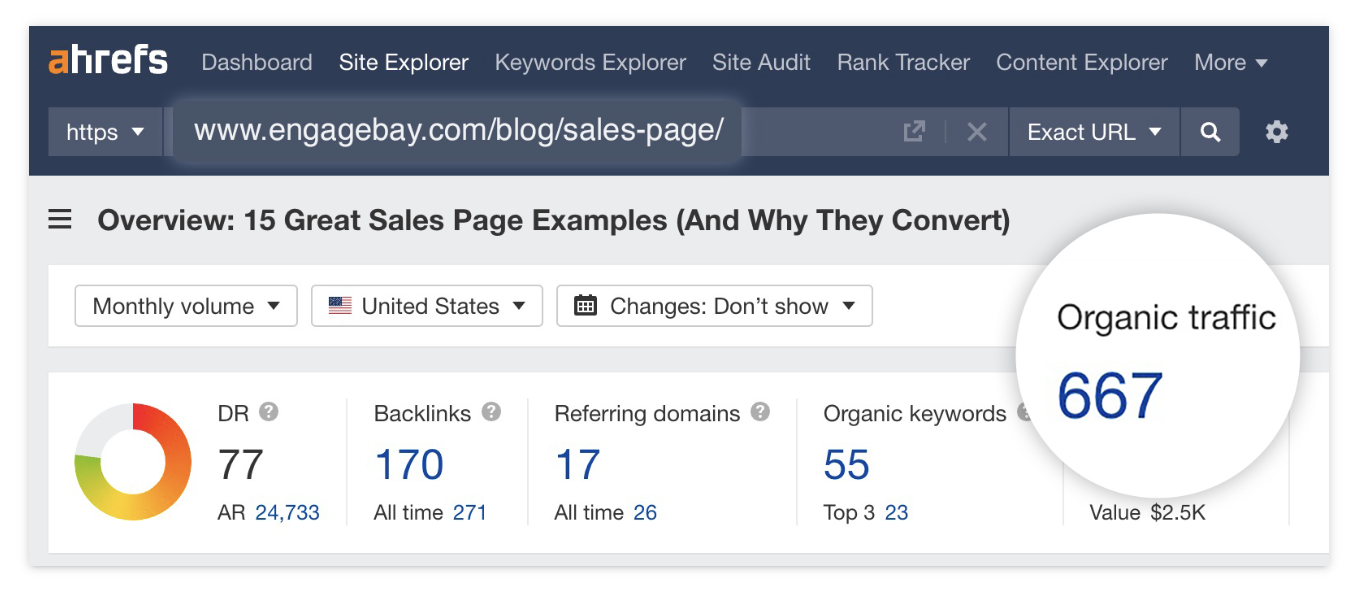
Instead of a straight screenshot, which comes across as messy (yes…I’m guilty! But my clients are not) they enhance their product images to highlight particular features and use cases.
Showing off your product is so important. But taking a graphics approach allows you to present your best side.
Additional Graphics Tips
✅ Avoid generic graphics and images. Visuals should have a purpose.
✅ Create a theme. Graphics should be on-brand and act as a common thread between articles. Don’t go “random” on every article.
✅ Avoid being confusing. Leave less to the reader's interpretation.
✅ Build a graphic design workflow.
—Benny
